Creating a mobile landing page is not just a useful addition, it is a necessity. With a huge number of people using the internet on mobile phones, your website’s ability to optimize content for mobile devices is crucial for your business growth.
What is a Mobile Landing Page?
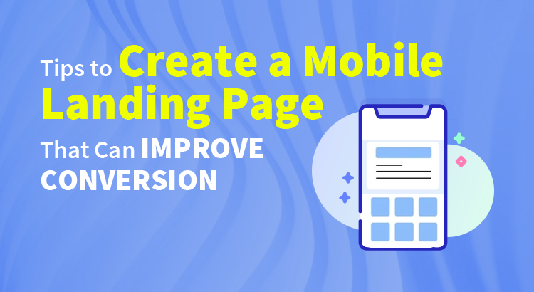
Firstly, you should understand what is a mobile landing page. Mobile landing pages are web pages created for mobile browsers that open when a potential customer clicks on an ad or search results via smartphones. This page should have simple navigation, a responsive design, and one call to action. Generally, it has one goal that is to make a user perform the desired action.
Related Article: Responsive Web Design has Greater Benefits
Important Tips to Build a Mobile landing Page
The list of top tips to create the best mobile landing pages to improve conversion.
1. Create Landing Pages Specifically for Mobile Devices
Creating websites and landing pages that are mobile-responsive is a good idea. But it’s great to create landing pages specific to phones and tablets. If you squeeze down a normal page to the smaller screen that can cause slow load times and a high bounce rate.
Designing a page specifically for mobile devices will guarantee the user experience will be good on any device. You could find the best landing page designer to build your mobile-first landing page.
2. Keep Your Content Short and Simple
The audience’s attention is getting lesser and lesser. Because of this, you have very little time to engage with the audience. Use the time effectively by using clear and concise.
You can use headlines that can instantly hook your site visitor. Also, use straightforward and easy-to-read content in shorter sentences. With the help of an SEO expert, you can SEO-friendly content for the best landing page.
Related Topic: Why SEO Is Important for Business to Achieve Online Growth?
3. Place Your CTA At the Top of Your Landing Page
Conversion rates are not related to scrolling time. Keeping them on the page is definitely better. But the best position for the CTA to be is at the top of your landing page, immediately after the headline.
That position will inform visitors what they get from your page. Therefore, placing CTA at the top of the page will increase conversion.
4. Don’t Overwhelm Your Audience with Too Many Visuals
Unlike a desktop layout, audiences will easily get overwhelmed by the images on a smaller screen. Use a minimum number of images on the page. The images should be very much relevant for the landing page and shouldn’t distract the potential customers from your CTA.
You must clearly communicate this with your professional web designers to get a mobile landing page design that could boost your conversion rates.
Tips to Create a Mobile Landing Page – Conclusion
Mobile landing pages can provide the best user experience on smaller devices. This will increase your conversion rates. The tips mentioned above will increase its effectiveness.


